


Container widgets are intended to be used with child widgets placed are placed inside the container. For example, a Tab widget is a container widget and each individual tab can have various other controls. The following sections explain the container widgets available in Designer.
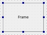
Frames
Frames are containers used to surround and group other widgets. They are commonly used to add a visual effect and indicate the grouped controls are some how related. The most important properties of frames are frameShape, frameShadow, lineWidth, and midLineWidth. These are described in more detail in the QFrame class description.
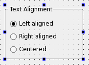
Group Boxes
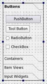
Group boxes are commonly used to group together a collection of checkboxes and radio buttons with similar purposes. Among the significant properties of group boxes are title, flat, checkable, and checked. These are described in the QGroupBox class documentation.
A group box can contain its own layout and this is necessary if the group contains other widgets. To add a layout to the group box click inside it and apply the layout as usual.
Stacked Widgets
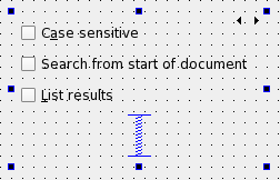
Stacked widgets contain multiple child widgets however only one is visible at any given time. Selecting the visible child widget is usually managed by another widget such as a combobox.
The Designer shows arrows in the top-right corner of the stacked widget. Clicking on the left and right arrows will move between the various child widgets. These arrows will not appear in the preview window or your user application. To navigate between pages in a stacked widget select the stacked widget and use the Next Page and Previous Page entries from the context menu.
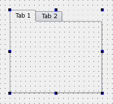
Tab Widgets
Tab widgets provide a modern approach for grouping related controls on a each tab. This container widget is useful when a large number of controls are required, however only one group needs to be displayed at any given time.
- Adding Tabs
- Select the tab widget and open its context menu
- Select Insert Page
- A page can be added before or after the current page
- The title of the current tab can be changed from the currentTabText property
- Deleting Tabs
- Click on a tab label to make it the current tab
- Open its context menu
- Select Delete Page
ToolBox Widgets
Toolbox widgets provide a series of sections which are displayed in a way similar to a stacked widget.
- To rename a page change the currentItemText property from the Property Editor
- To add a new page select Insert Page from the toolbox widget's context menu
- To delete a page select Delete Page from the toolbox widget's context menu
Dock Widgets
Dock widgets can be attached (docked) or remain floating as independent windows. A dock widget can only be docked to a main window at one of the four edges.
- Generated on Fri Jan 30 2026 10:00 by
 2.1.0
2.1.0