The following documentation contains multiple example to show various ways of using a Style Sheet to configure the appearance of the widgets in your application.
Foreground and Background Colors
In block 1 the background color is set to yellow for every QLineEdit in the given application. If you want this style to apply only to the QLineEdit objects in a specific window set the style for the relevant window, such as myDialog as shown in block 2.
There are two different ways to apply a style to one specific widget. The first option is to assign a value to the name property, which is a property in QObject. Then specify the value of the name property after the class name. The code for this is shown in block 3a where "QLineEdit#lastName" is used. Another option is to set the background color style directly on the QLineEdit and omit the selector. This is shown in block 3b.
In block 4 we are setting both the background color and the text color.
QApplication::instance()->
setStyleSheet(
"QLineEdit { background-color: yellow }");
myDialog->setStyleSheet("QLineEdit { background-color: green }");
myDialog->setStyleSheet("QLineEdit#lastName { background-color: green }");
lineEdit_1->
setStyleSheet(
"color: white; background-color: blue");
- See also
- background color
Using Dynamic Properties
There are many situations where a form with mandatory fields is required. To indicate to the user a field is mandatory, one effective solution is to use yellow as the background color. This can be implemented using CopperSpice Style Sheets as follows.
This means that every widget whose mandatoryField CopperSpice property is set to true would have a yellow background.
[mandatoryField="true"] { background-color: yellow }
For each mandatory field widget, we simply create a mandatoryField property on the fly and set it to true.
Using the Box Model and a QPushButton
The example shows the simplest way to create a red QPushButton. The result is a flat button with no borders.
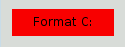
The result may be a flat red rectangle with no border for the following reasons.
-
Setting the background color for a push button may not be supported by the native theme
-
No values were provided for the border-width and border-style, so by default we obtain a 0-pixel wide border of style none
To improve the styling specifying a border as shown below.
background-color: red;
border-style: outset;
border-width: 2px;
border-color: beige;
}
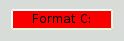
This version of our button has border however it is still a bit odd. Now we want to add some space between the border and the text using the padding property. Additionally, we will enforce a minimum width, round the corners, and specify a larger font to make the button look nicer.
background-color: red;
border-style: outset;
border-width: 2px;
border-radius: 10px;
border-color: beige;
font: bold 14px;
min-width: 10em;
padding: 6px;
}
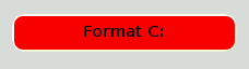
The only issue remaining is the button does not react when we press it. We can fix this by specifying a slightly different background color and use a different border style.
background-color: red;
border-style: outset;
border-width: 2px;
border-radius: 10px;
border-color: beige;
font: bold 14px;
min-width: 10em;
padding: 6px;
}
background-color: rgb(224, 0, 0);
border-style: inset;
}
QPushButton Menu Indicator
Subcontrols give access to the sub-elements of a widget. For example, a QPushButton associated with a menu (using QPushButton::setMenu()) has a menu indicator. This is how to customize the menu indicator for the red push button.
image: url(myindicator.png);
}
By default, the menu indicator is located at the bottom-right corner of the padding rectangle. We can change this by specifying subcontrol-position and subcontrol-origin to anchor the indicator differently. We can also use top and left to move the indicator by a few pixels.
image: url(myindicator.png);
subcontrol-position: right
center;
subcontrol-origin: padding;
}
This positions the myindicator.png to the center right of the QPushButton.
- See also
- subcontrol-origin, padding
Complex Selector Example
In this example we start by making the text in QLineEdit red by setting the following application wide stylesheet. We would also like to give a visual indication that a QLineEdit is read only by making it appear gray.
Now we add a requirement that every QLineEdit in our window with the name of "searchDialog" should have a text color of green. The style sheet is changed as shown below.
#seachDialog QLineEdit { color: green }
Now we have an issue since two rules will conflict. What text color is used for a QLineEdit in our searchDialog which the user can edit, should it be red or green? What about a read only QLineEdit which appears in a searchDialog, should it be gray or green? For information about how this issue is resolved refer to the documentation for Conflict Resolution.
Customizing Specific Widgets
This section provides examples to customize specific widgets using Style Sheets.
QAbstractScrollArea
The background of any QAbstractScrollArea (Item views, QTextEdit and QTextBrowser) can be set using the background properties. For example, to set a background-image that scrolls with the scroll bar.
background-color: white;
background-image: url(draft.png);
background-attachment: scroll;
}
If the background-image is to be fixed with the viewport:
background-color: white;
background-image: url(draft.png);
background-attachment:
fixed;
}
QCheckBox
Styling of a QCheckBox is almost identical to styling a QRadioButton. The main difference is that a tristate QCheckBox has an indeterminate state.
spacing: 5px;
}
QCheckBox::indicator {
width: 13px;
height: 13px;
}
QCheckBox::indicator:unchecked {
image: url(:/images/checkbox_unchecked.png);
}
QCheckBox::indicator:unchecked:hover {
image: url(:/images/checkbox_unchecked_hover.png);
}
QCheckBox::indicator:unchecked:pressed {
image: url(:/images/checkbox_unchecked_pressed.png);
}
QCheckBox::indicator:checked {
image: url(:/images/checkbox_checked.png);
}
QCheckBox::indicator:checked:hover {
image: url(:/images/checkbox_checked_hover.png);
}
QCheckBox::indicator:checked:pressed {
image: url(:/images/checkbox_checked_pressed.png);
}
QCheckBox::indicator:indeterminate:hover {
image: url(:/images/checkbox_indeterminate_hover.png);
}
QCheckBox::indicator:indeterminate:pressed {
image: url(:/images/checkbox_indeterminate_pressed.png);
}
QComboBox
We will look at an example where the drop down button of a QComboBox appears "merged" with the combo box frame.
border: 1px solid gray;
border-radius: 3px;
padding: 1px 18px 1px 3px;
min-width: 6em;
}
background: white;
}
QComboBox:!editable, QComboBox::drop-down:editable {
stop: 0 #E1E1E1, stop: 0.4 #DDDDDD,
stop: 0.5 #D8D8D8, stop: 1.0 #D3D3D3);
}
QComboBox:!editable:on, QComboBox::drop-down:editable:on {
stop: 0 #D3D3D3, stop: 0.4 #D8D8D8,
stop: 0.5 #DDDDDD, stop: 1.0 #E1E1E1);
}
padding-top: 3px;
}
QComboBox::drop-down {
subcontrol-origin: padding;
subcontrol-position: top
right;
width: 15px;
border-left-width: 1px;
border-left-color: darkgray;
border-left-style: solid;
border-top-right-radius: 3px;
border-bottom-right-radius: 3px;
}
QComboBox::down-arrow {
image: url(/usr/share/icons/crystalsvg/16x16/actions/1downarrow.png);
}
QComboBox::down-arrow:on {
top: 1px;
}
The pop-up of the QComboBox is a QAbstractItemView and is styled using the descendant selector.
border: 2px solid darkgray;
selection-background-color: lightgray;
}
QDockWidget
The title bar and the buttons of a QDockWidget can be customized as follows.
border: 1px solid lightgray;
titlebar-close-icon: url(close.png);
titlebar-normal-icon: url(undock.png);
}
QDockWidget::title {
background: lightgray;
}
border: 1px solid transparent;
background: darkgray;
padding: 0px;
}
background: gray;
}
padding: 1px -1px -1px 1px;
}
If one desires to move the dock widget buttons to the left, the following style sheet can be used.
border: 1px solid lightgray;
titlebar-close-icon: url(close.png);
titlebar-normal-icon: url(float.png);
}
QDockWidget::title {
background: lightgray;
}
background: darkgray;
padding: 0px;
icon-size: 14px;
}
background: gray;
}
padding: 1px -1px -1px 1px;
}
subcontrol-position: top
left;
subcontrol-origin: margin;
position: absolute;
top: 0px;
left: 0px; bottom: 0px;
width: 14px;
}
QDockWidget::float-button {
subcontrol-position: top
left;
subcontrol-origin: margin;
position: absolute;
top: 0px;
left: 16px; bottom: 0px;
width: 14px;
}
To customize the separator (resize handle) of a QDockWidget use QMainWindow::separator.
QFrame
A QFrame is styled using the box model.
border: 2px solid green;
border-radius: 4px;
padding: 2px;
background-image: url(images/welcome.png);
}
QGroupBox
This is an example which moves the QGroupBox title to the center.
background-color:
qlineargradient(x1: 0, y1: 0, x2: 0, y2: 1, stop: 0 #E0E0E0, stop: 1 #FFFFFF);
border: 2px solid gray;
border-radius: 5px;
margin-top: 1ex;
}
subcontrol-origin: margin;
subcontrol-position: top
center;
padding: 0 3px;
background-color:
qlineargradient(x1: 0, y1: 0, x2: 0, y2: 1, stop: 0 #FFOECE, stop: 1 #FFFFFF);
}
For a checkable QGroupBox use the ::indicator subcontrol and style it exactly like a QCheckBox.
QGroupBox::indicator {
width: 13px;
height: 13px;
}
QGroupBox::indicator:unchecked {
image: url(:/images/checkbox_unchecked.png);
}
QHeaderView
QHeaderView can be customized as follows.
QHeaderView::section {
stop:0 #616161, stop: 0.5 #505050,
stop: 0.6 #434343, stop:1 #656565);
color: white;
border: 1px solid #6c6c6c;
}
QHeaderView::section:checked
{
background-color: red;
}
QHeaderView::down-arrow {
image: url(down_arrow.png);
}
QHeaderView::up-arrow {
image: url(up_arrow.png);
}
QLineEdit
The frame of a QLineEdit is styled using the "The Box Model" to create a line edit with rounded corners.
border: 2px solid gray;
border-radius: 10px;
padding: 0 8px;
background: yellow;
selection-background-color: darkgray;
}
The password character of line edits that have QLineEdit::Password echo mode can be set using.
lineedit-password-character: 9679;
}
The background of a read only QLineEdit can be modified as below:
QListView
The background color of alternating rows can be customized using the following style sheet.
alternate-background-color: yellow;
}
To provide a special background when you hover over items, we can use the ::item subcontrol. For example,
show-decoration-selected: 1;
}
QListView::item:alternate {
background: #EEEEEE;
}
QListView::item:selected {
border: 1px solid #6a6ea9;
}
QListView::item:selected:!active {
stop: 0 #ABAFE5, stop: 1 #8588B2);
}
QListView::item:selected:active {
stop: 0 #6a6ea9, stop: 1 #888dd9);
}
QListView::item:hover {
stop: 0 #FAFBFE, stop: 1 #DCDEF1);
}
QMainWindow
The separator of a QMainWindow can be styled as follows.
QMainWindow::separator {
background: yellow;
width: 10px;
height: 10px;
}
QMainWindow::separator:hover {
background: red;
}
QMenu
Individual items of a QMenu are styled using the 'item' subcontrol as follows.
background-color: #ABABAB;
border: 1px solid black;
}
QMenu::item {
background-color: transparent;
}
QMenu::item:selected {
background-color: #654321;
}
For a more advanced customization, use a style sheet as follows.
background-color: white;
margin: 2px;
}
QMenu::item {
padding: 2px 25px 2px 20px;
border: 1px solid transparent;
}
QMenu::item:selected {
border-color: darkblue;
background: rgba(100, 100, 100, 150);
}
background: gray;
border: 1px inset gray;
position: absolute;
top: 1px;
bottom: 1px;
}
QMenu::separator {
height: 2px;
background: lightblue;
}
QMenu::indicator {
width: 13px;
height: 13px;
}
QMenu::indicator:non-exclusive:unchecked {
image: url(:/images/checkbox_unchecked.png);
}
QMenu::indicator:non-exclusive:unchecked:selected {
image: url(:/images/checkbox_unchecked_hover.png);
}
QMenu::indicator:non-exclusive:checked {
image: url(:/images/checkbox_checked.png);
}
QMenu::indicator:non-exclusive:checked:selected {
image: url(:/images/checkbox_checked_hover.png);
}
QMenu::indicator:exclusive:unchecked {
image: url(:/images/radiobutton_unchecked.png);
}
QMenu::indicator:exclusive:unchecked:selected {
image: url(:/images/radiobutton_unchecked_hover.png);
}
QMenu::indicator:exclusive:checked {
image: url(:/images/radiobutton_checked.png);
}
QMenu::indicator:exclusive:checked:selected {
image: url(:/images/radiobutton_checked_hover.png);
}
QMenuBar
QMenuBar is styled as follows.
background-color:
qlineargradient(x1:0, y1:0, x2:0, y2:1, stop:0 lightgray, stop:1 darkgray);
}
QMenuBar::item {
spacing: 3px;
padding: 1px 4px;
background: transparent;
border-radius: 4px;
}
QMenuBar::item:selected {
background: #a8a8a8;
}
QMenuBar::item:pressed {
background: #888888;
}
QProgressBar
The QProgressBar border, chunk, and text-align can be customized using style sheets. However, if one property or subcontrol is customized, all the other properties or subcontrols must be customized.
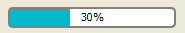
For example, we change the border to grey and the chunk to cerulean.
border: 2px solid grey;
border-radius: 5px;
}
QProgressBar::chunk {
background-color: #05B8CC;
width: 20px;
}
This leaves the text-align, which we customize by positioning the text in the center of the progress bar.
border: 2px solid grey;
border-radius: 5px;
}
A margin can be included to obtain more visible chunks.
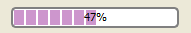
QProgressBar::chunk {
background-color: #CD96CD;
width: 10px;
margin: 0.5px;
}
QPushButton
A QPushButton is styled as follows.
border: 2px solid #8f8f91;
border-radius: 6px;
stop: 0 #f6f7fa, stop: 1 #dadbde);
min-width: 80px;
}
stop: 0 #dadbde, stop: 1 #f6f7fa);
}
border: none;
}
border-color: navy;
}
For a QPushButton with a menu, use the ::menu-indicator subcontrol.
stop: 0 #dadbde, stop: 1 #f6f7fa);
}
image: url(menu_indicator.png);
subcontrol-origin: padding;
subcontrol-position: bottom
right;
}
position: relative;
}
Checkable QPushButton have the :checked pseudo state set.
QRadioButton
The indicator of a QRadioButton can be changed using the following style.
QRadioButton::indicator {
width: 13px;
height: 13px;
}
QRadioButton::indicator::unchecked {
image: url(:/images/radiobutton_unchecked.png);
}
QRadioButton::indicator:unchecked:hover {
image: url(:/images/radiobutton_unchecked_hover.png);
}
QRadioButton::indicator:unchecked:pressed {
image: url(:/images/radiobutton_unchecked_pressed.png);
}
QRadioButton::indicator::checked {
image: url(:/images/radiobutton_checked.png);
}
QRadioButton::indicator:checked:hover {
image: url(:/images/radiobutton_checked_hover.png);
}
QRadioButton::indicator:checked:pressed {
image: url(:/images/radiobutton_checked_pressed.png);
}
QScrollBar
The QScrollBar can be styled using its subcontrols like handle, add-line, sub-line, and so on. If one property or subcontrol is customized, all the other properties or subcontrols must be customized as well.
The scroll bar above has been styled in aquamarine with a solid grey border.
border: 2px solid grey;
background: #32CC99;
height: 15px;
margin: 0px 20px 0 20px;
}
QScrollBar::handle:horizontal {
background: white;
min-width: 20px;
}
QScrollBar::add-line:horizontal {
border: 2px solid grey;
background: #32CC99;
width: 20px;
subcontrol-position:
right;
subcontrol-origin: margin;
}
QScrollBar::sub-line:horizontal {
border: 2px solid grey;
background: #32CC99;
width: 20px;
subcontrol-position:
left;
subcontrol-origin: margin;
}
The left-arrow and right-arrow have a solid grey border with a white background. As an alternative, you could also embed the image of an arrow.
QScrollBar:left-arrow:horizontal, QScrollBar::right-arrow:horizontal {
border: 2px solid grey;
width: 3px;
height: 3px;
background: white;
}
QScrollBar::add-page:horizontal, QScrollBar::sub-page:horizontal {
background: none;
}
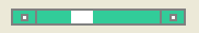
If you want the scroll buttons of the scroll bar to be placed together (instead of the edges) like on Mac OS X, you can use the following stylesheet.
border: 2px solid green;
background: cyan;
height: 15px;
margin: 0px 40px 0 0px;
}
QScrollBar::handle:horizontal {
background: gray;
min-width: 20px;
}
QScrollBar::add-line:horizontal {
background: blue;
width: 16px;
subcontrol-position:
right;
subcontrol-origin: margin;
border: 2px solid black;
}
QScrollBar::sub-line:horizontal {
background: magenta;
width: 16px;
subcontrol-position: top
right;
subcontrol-origin: margin;
border: 2px solid black;
position: absolute;
}
QScrollBar:left-arrow:horizontal, QScrollBar::right-arrow:horizontal {
width: 3px;
height: 3px;
background: pink;
}
QScrollBar::add-page:horizontal, QScrollBar::sub-page:horizontal {
background: none;
}
The scroll bar using the above stylesheet looks like this.

To customize a vertical scroll bar use a style sheet similar to the following.
border: 2px solid grey;
background: #32CC99;
width: 15px;
margin: 22px 0 22px 0;
}
QScrollBar::handle:vertical {
background: white;
min-height: 20px;
}
QScrollBar::add-line:vertical {
border: 2px solid grey;
background: #32CC99;
height: 20px;
subcontrol-position: bottom;
subcontrol-origin: margin;
}
QScrollBar::sub-line:vertical {
border: 2px solid grey;
background: #32CC99;
height: 20px;
subcontrol-position: top;
subcontrol-origin: margin;
}
QScrollBar::up-arrow:vertical, QScrollBar::down-arrow:vertical {
border: 2px solid grey;
width: 3px;
height: 3px;
background: white;
}
QScrollBar::add-page:vertical, QScrollBar::sub-page:vertical {
background: none;
}
QSizeGrip
QSizeGrip is usually styled by just setting an image.
image: url(:/images/sizegrip.png);
width: 16px;
height: 16px;
}
QSlider
You can style horizontal slider as below.
QSlider::groove:horizontal {
border: 1px solid #999999;
height: 8px;
background:
qlineargradient(x1:0, y1:0, x2:0, y2:1, stop:0 #B1B1B1, stop:1 #c4c4c4);
margin: 2px 0;
}
QSlider::handle:horizontal {
background:
qlineargradient(x1:0, y1:0, x2:1, y2:1, stop:0 #b4b4b4, stop:1 #8f8f8f);
border: 1px solid #5c5c5c;
width: 18px;
margin: -2px 0;
border-radius: 3px;
}
If you want to change the color of the slider parts before and after the handle, you can use the add-page and sub-page subcontrols. For example, for a vertical slider.
QSlider::groove:vertical {
background: red;
position: absolute;
}
QSlider::handle:vertical {
height: 10px;
background: green;
margin: 0 -4px;
}
QSlider::add-page:vertical {
background: white;
}
QSlider::sub-page:vertical {
background: pink;
}
QSpinBox
QSpinBox can be customized as shown below.
border-image: url(:/images/frame.png) 4;
border-width: 3;
}
QSpinBox::up-button {
subcontrol-origin: border;
subcontrol-position: top
right;
width: 16px;
border-image: url(:/images/spinup.png) 1;
border-width: 1px;
}
QSpinBox::up-button:hover {
border-image: url(:/images/spinup_hover.png) 1;
}
QSpinBox::up-button:pressed {
border-image: url(:/images/spinup_pressed.png) 1;
}
QSpinBox::up-arrow {
image: url(:/images/up_arrow.png);
width: 7px;
height: 7px;
}
QSpinBox::up-arrow:disabled, QSpinBox::up-arrow:off {
image: url(:/images/up_arrow_disabled.png);
}
QSpinBox::down-button {
subcontrol-origin: border;
subcontrol-position: bottom
right;
width: 16px;
border-image: url(:/images/spindown.png) 1;
border-width: 1px;
border-top-width: 0;
}
QSpinBox::down-button:hover {
border-image: url(:/images/spindown_hover.png) 1;
}
QSpinBox::down-button:pressed {
border-image: url(:/images/spindown_pressed.png) 1;
}
QSpinBox::down-arrow {
image: url(:/images/down_arrow.png);
width: 7px;
height: 7px;
}
QSpinBox::down-arrow:disabled,
QSpinBox::down-arrow:off {
image: url(:/images/down_arrow_disabled.png);
}
QSplitter
A QSplitter derives from a QFrame and can be styled like a QFrame. The grip or the handle is customized using the handle subcontrol.
image: url(images/splitter.png);
}
width: 2px;
}
height: 2px;
}
image: url(images/splitter_pressed.png);
}
QStatusBar
We can provide a background for the status bar and a border for items inside the status bar as follows.
background: brown;
}
QStatusBar::item {
border: 1px solid red;
border-radius: 3px;
}
Widgets that have been added to the QStatusBar can be styled using the descendant declaration.
border: 3px solid white;
}
QTabWidget and QTabBar
For this image we need a stylesheet as shown below.
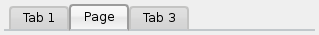
QTabWidget::pane {
border-top: 2px solid #C2C7CB;
}
QTabWidget::tab-bar {
}
QTabBar::tab {
stop: 0 #E1E1E1, stop: 0.4 #DDDDDD,
stop: 0.5 #D8D8D8, stop: 1.0 #D3D3D3);
border: 2px solid #C4C4C3;
border-bottom-color: #C2C7CB;
border-top-left-radius: 4px;
border-top-right-radius: 4px;
min-width: 8ex;
padding: 2px;
}
QTabBar::tab:selected, QTabBar::tab:hover {
stop: 0 #fafafa, stop: 0.4 #f4f4f4,
stop: 0.5 #e7e7e7, stop: 1.0 #fafafa);
}
QTabBar::tab:selected {
border-color: #9B9B9B;
border-bottom-color: #C2C7CB;
}
QTabBar::tab:!selected {
margin-top: 2px;
}
Often we require the tabs to overlap to look like below.
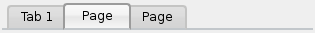
For a tab widget that looks like above, we make use of negative margins. The resulting stylesheet looks like this.
QTabWidget::pane {
border-top: 2px solid #C2C7CB;
}
QTabWidget::tab-bar {
}
QTabBar::tab {
stop: 0 #E1E1E1, stop: 0.4 #DDDDDD,
stop: 0.5 #D8D8D8, stop: 1.0 #D3D3D3);
border: 2px solid #C4C4C3;
border-bottom-color: #C2C7CB;
border-top-left-radius: 4px;
border-top-right-radius: 4px;
min-width: 8ex;
padding: 2px;
}
QTabBar::tab:selected, QTabBar::tab:hover {
stop: 0 #fafafa, stop: 0.4 #f4f4f4,
stop: 0.5 #e7e7e7, stop: 1.0 #fafafa);
}
QTabBar::tab:selected {
border-color: #9B9B9B;
border-bottom-color: #C2C7CB;
}
QTabBar::tab:!selected {
margin-top: 2px;
}
QTabBar::tab:selected {
}
QTabBar::tab:first:selected {
}
QTabBar::tab:last:selected {
}
QTabBar::tab:only-one {
margin: 0;
}
To move the tab bar to the center (as below), we require the following stylesheet.

QTabWidget::pane {
border-top: 2px solid #C2C7CB;
position: absolute;
top: -0.5em;
}
QTabWidget::tab-bar {
}
QTabBar::tab {
stop: 0 #E1E1E1, stop: 0.4 #DDDDDD,
stop: 0.5 #D8D8D8, stop: 1.0 #D3D3D3);
border: 2px solid #C4C4C3;
border-bottom-color: #C2C7CB;
border-top-left-radius: 4px;
border-top-right-radius: 4px;
min-width: 8ex;
padding: 2px;
}
QTabBar::tab:selected, QTabBar::tab:hover {
stop: 0 #fafafa, stop: 0.4 #f4f4f4,
stop: 0.5 #e7e7e7, stop: 1.0 #fafafa);
}
QTabBar::tab:selected {
border-color: #9B9B9B;
border-bottom-color: #C2C7CB;
}
The tear indicator and the scroll buttons can be further customized as follows:
QTabBar::tear {
image: url(tear_indicator.png);
}
QTabBar::scroller {
width: 20px;
}
border-image: url(scrollbutton.png) 2;
border-width: 2px;
}
image: url(rightarrow.png);
}
image: url(leftarrow.png);
}
The close button can be customized as follow.
image: url(close.png)
subcontrol-position: left;
}
image: url(close-hover.png)
}
QTableView
Suppose we like our selected item in QTableView to have pink fade to white as its background.
This is possible with the selection-background-color property.
selection-background-color:
qlineargradient(x1: 0, y1: 0, x2: 0.5, y2: 0.5,
stop: 0 #FF92BB, stop: 1 white);
}
The corner widget can be customized using the following style sheet.
background: red;
border: 2px outset red;
}
QToolBar
The background and the handle of a QToolBar is customized as shown below.
background: red;
spacing: 3px;
}
QToolBar::handle {
image: url(handle.png);
}
QToolBox
The tabs of the QToolBox are customized using the 'tab' subcontrol.
QToolBox::tab {
stop: 0 #E1E1E1, stop: 0.4 #DDDDDD,
stop: 0.5 #D8D8D8, stop: 1.0 #D3D3D3);
border-radius: 5px;
color: darkgray;
}
QToolBox::tab:selected {
font: italic;
color: white;
}
QToolButton
There are three types for QToolButton.
-
Has no menu and styled exactly like QPushButton.
-
Has a menu and has the QToolButton::popupMode set to QToolButton::DelayedPopup or QToolButton::InstantPopup. In this case the QToolButton is styled exactly like a QPushButton with a menu.
-
Has QToolButton::popupMode set to QToolButton::MenuButtonPopup, in this case we style it as shown below.
Refer to Customizing QPushButton for an example of the menu-indicator pseudo state.
border: 2px solid #8f8f91;
border-radius: 6px;
stop: 0 #f6f7fa, stop: 1 #dadbde);
}
}
stop: 0 #dadbde, stop: 1 #f6f7fa);
}
border: 2px solid gray;
border-top-right-radius: 6px;
border-bottom-right-radius: 6px;
width: 16px;
}
image: url(downarrow.png);
}
}
QToolTip
QToolTip is customized exactly like a QLabel. In addition for platforms which support this, the opacity property may be set to adjust the opacity.
border: 2px solid darkkhaki;
padding: 5px;
border-radius: 3px;
opacity: 200;
}
QTreeView
The background color of alternating rows can be customized using the following style sheet.
alternate-background-color: yellow;
}
To provide a special background when you hover over items, we can use the ::item subcontrol.
show-decoration-selected: 1;
}
QTreeView::item {
border: 1px solid #d9d9d9;
border-top-color: transparent;
border-bottom-color: transparent;
}
QTreeView::item:hover {
background:
qlineargradient(x1: 0, y1: 0, x2: 0, y2: 1, stop: 0 #e7effd, stop: 1 #cbdaf1);
border: 1px solid #bfcde4;
}
QTreeView::item:selected {
border: 1px solid #567dbc;
}
QTreeView::item:selected:active{
background:
qlineargradient(x1: 0, y1: 0, x2: 0, y2: 1, stop: 0 #6ea1f1, stop: 1 #567dbc);
}
QTreeView::item:selected:!active {
background:
qlineargradient(x1: 0, y1: 0, x2: 0, y2: 1, stop: 0 #6b9be8, stop: 1 #577fbf);
}
The branches of a QTreeView are styled using the ::branch subcontrol. The following stylesheet color codes the various states when drawing a branch.
QTreeView::branch {
background: palette(base);
}
QTreeView::branch:has-siblings:!adjoins-item {
background: cyan;
}
QTreeView::branch:has-siblings:adjoins-item {
background: red;
}
QTreeView::branch:!has-children:!has-siblings:adjoins-item {
background: blue;
}
QTreeView::branch:closed:has-children:has-siblings {
background: pink;
}
QTreeView::branch:has-children:!has-siblings:closed {
background: gray;
}
QTreeView::branch:open:has-children:has-siblings {
background: magenta;
}
QTreeView::branch:open:has-children:!has-siblings {
background: green;
}
Colorful is a more useful example and it uses the following images.
 |  |  |  |  |
| vline.png | branch-more.png | branch-end.png | branch-closed.png | branch-open.png |
QTreeView::branch:has-siblings:!adjoins-item {
border-image: url(vline.png) 0;
}
QTreeView::branch:has-siblings:adjoins-item {
border-image: url(branch-more.png) 0;
}
QTreeView::branch:!has-children:!has-siblings:adjoins-item {
border-image: url(branch-end.png) 0;
}
QTreeView::branch:has-children:!has-siblings:closed,
QTreeView::branch:closed:has-children:has-siblings {
border-image: none;
image: url(branch-closed.png);
}
QTreeView::branch:open:has-children:!has-siblings,
QTreeView::branch:open:has-children:has-siblings {
border-image: none;
image: url(branch-open.png);
}
This is how the resulting tree view will look.
Common Mistakes
This section lists some common mistakes when using stylesheets.
Buttons and Images
When styling a QPushButton it is often desirable to use an image as the button graphic. It is common to try the background-image property, but this has a number of drawbacks. For instance, the background will often appear hidden behind the button decoration, because it is not considered a background. In addition, if the button is resized, the entire background will be stretched or tiled, which does not always look good.
It is better to use the border-image property, as it will always display the image, regardless of the background (you can combine it with a background if it has alpha values in it), and it has special settings to deal with button resizing.
color: grey;
border-image: url(/home/kamlie/code/button.png) 3 10 3 10;
border-top: 3px transparent;
border-bottom: 3px transparent;
border-
right: 10px transparent;
border-
left: 10px transparent;
}
This code will produce a button which looks like the following.
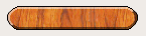
The numbers after the url gives the top, right, bottom and left number of pixels, respectively. These numbers correspond to the border and should not stretch when the size changes. Whenever you resize the button, the middle part of the image will stretch in both directions, while the pixels specified in the stylesheet will not. This makes the borders of the button look more natural
 |
| With borders |
 |
| Without borders |
- See also
- QStyle, Supported HTML Subset


 2.1.0
2.1.0