


Most of the features of the Designer application are accessible from either the main menu, toolbar, or the widget box. Other features are available through context menus which can be accessed by right clicking on a widget.
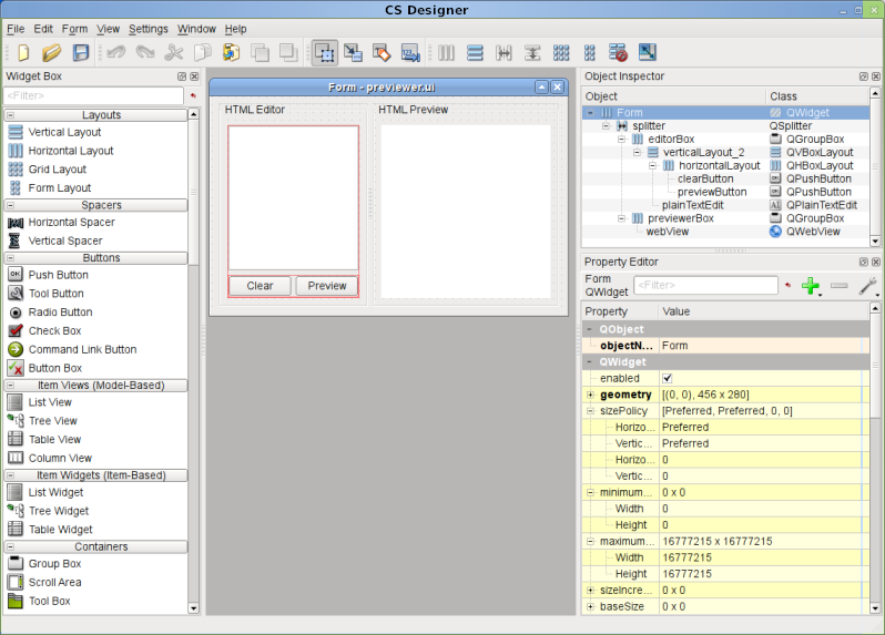
The Widget Box which is shown on the left side in the image below, provides a selection of common layouts and widgets which can be used to construct and build a user interface. The components are grouped into categories which reflect their usage. For example, the widgets located in the Buttons group are the different types of buttons which can be used to create a graphical user interface. These include a push button, radio button, and a check box.
Components are added to any open form by dragging a given widget from the Widget Box and then dropping it on the form in the desired location. Refer to UI Form Edit Mode for more information about how to edit a form.
Layouts
Layouts are used to arrange and manage the widgets of a user interface. The purpose of using a layout is to control the spacing, sizing, and geometry of the widgets in a given layout. There are four different types of layouts available in CS Designer.
For any given widget there is a recommended size which is known as the sizeHint property. The layout will attempt to resize the widget to meet the size hint of the widget. In some cases the size is not flexible. For example, the height of a QLineEdit is always a fixed value and depends only on the font size and style.
Most widgets have a range of a minimumSize and maximumSize so when the sizeHint can not be achieved the size of a widget will fall between the given range. All of the properties can be modified in the Property Editor.
Example
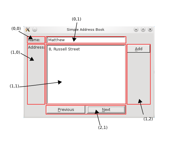
The following image is a diagram of a form which is using a QGridLayout. The coordinates show the position of each widget within the grid. The grid is a 3 x 3 matrix and three of the nine cells are empty. The Previous and Next QPushButton objects are located in a QHBoxLayout, which is added to position 2,1 in the grid. The Add button is added to a QVBoxLayout and this layout is then added to position 1,2 in the grid layout.
The grid layout will attempt to use the smallest amount of space to display all the widgets which are in the layout. If the grid is resized by the user the widgets will be resized proportionally. Vertical and Horizontal spacers can be added to the layout to indicate where any extra space should be dispersed.
Refer to the Layout Management documentation for more information.
- Generated on Fri Jan 30 2026 10:00 by
 2.1.0
2.1.0