


The QStyle class is an abstract base class. Any class which inherits from QStyle is referred to as a style class. These style classes are responsible for drawing the contents of most widgets and supporting the look and feel of a particular GUI theme. Most classes which inherit from QWidget should call methods declared in QStyle to ensure they respect the native look and feel.
There are several built in styles however some of these may only be available on specific platforms. Custom styles can be implemented as a plugin or by inheriting from QStyle and passing this custom style to QApplication::setStyle().
QStyle API
The main focus of QStyle is to draw graphical elements. An element is some part of a widget like a window frame or a scroll bar. There are other methods in QStyle which can be used to compute values required as part of the drawing process. As an example there are methods to calculate the position of a slider handle and the size hint for a widget.
Most of the draw methods in this class take four arguments as listed below.
- An enum value specifying which graphical element to draw
- QStyleOption object which specifies how and where to render the element
- QPainter object which is used to draw the element
- QWidget where the drawing occurs
Item Views
Item views like QTableView or QTreeView draw their items by calling delegates. The item view headers are drawn by directly calling methods in QStyle. The default delegate is QStyledItemDelegate which uses QStyle to draw some portion of each item.
Writing a Custom Style Class
To customize an existing style inherit from QProxyStyle and override the virtual methods required by your application. Any methods which are not overridden will use an implementation from an existing style class corresponding to your current platform.
These are the fallback style classes for each platform.
- X11
- QFusionStyle or QGtkStyle
- Windows
- QWindowsVistaStyle
- Cocoa
- QMacStyle
Style Elements
The task of drawing a widget is divided into a group of components where each component is referred to as a style element. The style elements can be represented as a tree structure.
As an example, when drawing a push button QStyle will actually draw a label with the text or icon, a button bevel, and a focus frame. This requires three different style elements. The button bevel style element consists of a frame and two other style elements. The following diagram shows a section of the push button style element tree structure.
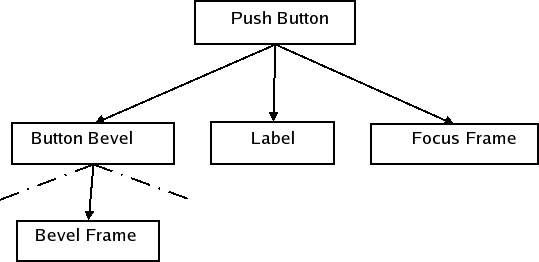
Overview of Style Elements
There are three kinds of style elements which are defined by the QStyle::PrimitiveElement, QStyle::ControlElement, and QStyle::ComplexControl enums.
Primitive Elements (1)
Primitive elements are basic GUI elements which are used to draw multiple widgets. Examples of these are frames, button bevels, arrows for spin boxes, scroll bars, and combo boxes.
Control Elements (2)
A control style element performs an action or displays information to the user. Examples of control elements are push buttons, check boxes, and header sections in tables and tree views. Control elements are not necessarily complete widgets such as push buttons, but can also be widget parts such as a tab in a tab bar or the slider from a scroll bar. Controls which consist of several elements often use the style to calculate the bounding rectangles of the elements.
Complex Control Elements (3)
Complex control elements contain sub controls. Complex controls behave differently depending on where the user handles them with the mouse and which keyboard keys are pressed. This is dependent on which sub control that the mouse is over or received a mouse press. Examples of complex controls are scroll bars and combo boxes. With a scroll bar, you can use the mouse to move the slider and press the line up and line down buttons. The available sub controls are defined by the SubControl enum.
In addition to drawing, the style needs to provide the widgets with information on which sub control a mouse press was made on. For instance a QScrollBar needs to know if the user pressed the slider, the slider groove, or one of the buttons.
Sub controls are not the same as the control elements described in the previous section. You can not use the style to draw a sub control. The style will only calculate the bounding rectangle in which the sub control should be drawn. It is common for complex elements to use control and primitive elements when drawing their sub controls. This is an approach frequently used by the built in styles in CopperSpice.
Other Features in QStyle
The current style to responsible for calculating the bounding rectangles of sub elements and sub controls. The style also computes pixel metrics which provide a style dependent size in screen pixels for drawing. The bounding rectangles and pixel metrics are represented by three enums, QStyle::SubElement, QStyle::SubControl, and QStyle::PixelMetric. Values of the enums can be identified as they start with SE_, SC_ and PM_ respectively.
The style also stores a set of style hints which are represented as values in the QStyle::StyleHint enum. Not all widgets have the same look and feel in different styles. For instance, when menu items in a menu do not fit in a single column on the screen some styles support scrolling while others draw more than one column to fit all items.
Widgets like message boxes or file dialogs have can be displayed using a set of standard images such as a question mark or a warning icon. The QStyle class represents these images using an enum named QStyle::StandardPixmap.
The style calculates the spacing between widgets in layouts. There are two ways the style can handle these calculations. You can set the PM_LayoutHorizontalSpacing and PM_LayoutVerticalSpacing. Alternatively, you can implement QStyle::layoutSpacing() and QStyle::layoutSpacingImplementation() if you need more control over this part of the layout. In these methods you can calculate the spacing based on control types (QSizePolicy::ControlType) for different size policies (QSizePolicy::Policy) and also the style option for the widget in question.
Style Options
The sub-classes of QStyleOption contain all of the necessary information to style the individual elements. Style options are instantiated by the caller of a method in the QStyle class. Depending on what is drawn the style will expect a different style option class. For example, the QStyle::PE_FrameFocusRect element expects a QStyleOptionFocusRect argument, and it is possible to create custom subclasses that a custom style can use. The style options have public data members for performance reasons.
The widgets can be in a number of different states, which are defined by the State enum. Some of the state flags have different meanings depending on the widget, but others are common for all widgets like QStyle::State_Disabled. It is QStyleOption that sets the common states with QStyleOption::initFrom(). The rest of the states are set by the individual widgets.
The style options contain the palette and bounding rectangles of the widgets to be drawn. Most widgets have specialized style options. As an example, QPushButton and QCheckBox use QStyleOptionButton as their style option, which contains the text, icon, and the size of the icon.
When reimplementing QStyle methods which take a QStyleOption parameter, you often need to cast the QStyleOption to a subclass like QStyleOptionFocusRect. You can use qstyleoption_cast() to ensure the pointer type is correct. If the object is not the right data type qstyleoption_cast() returns a nullptr.
The following code illustrates how to use QStyle to draw the focus rectangle in a custom widget paintEvent().
The next example shows how to inherit from an existing style to customize the look of a graphical element.
QStyle Drawing Methods
The QStyle class contains three methods for drawing the primitive, control, and complex elements. These methods are drawPrimitive(), drawControl(), and drawComplexControl() respectively.
There are other drawing methods which are used when drawing specific elements. The drawItemText() method draws text within a specified rectangle and drawItemPixmap() aligns a pixmap within a specified bounding rectangle.
Every widget is passed to the polish() method before being shown on the screen and to unpolish() when they are hidden. You can use these methods to set attributes on the widgets or do other work required by your style. For instance, if you need to know when the mouse is hovering over the widget, set the Qt::WA_Hover widget attribute. The QStyle::State_MouseOver state flag will then be set in the widget style options.
The following are other methods in QStyle which may be of value when drawing certain widgets.
- QStyle::subElementRect() receives a SubElement enum value and calculates a bounding rectangle for that sub element. The style uses this method to know where to draw the different parts of an element. If you create a new style, you can use the same location of sub elements as the super class.
- QStyle::subControlRect() is used to calculate bounding rectangles for sub controls in complex controls. When you implement a new style, you should override subControlRect() and calculate the rectangles which are different from the super class.
- QStyle::pixelMetric() returns a pixel metric, which is a style dependent size given in screen pixels. It takes a value of the PixelMetric enum and returns the correct measure. Pixel metrics do not necessarily have to be static measures, but can be calculated with, for example, the style option.
- QStyle::hitTestComplexControl() returns the sub control that the mouse pointer is over in a complex control. Usually, this is simply a matter of using subControlRect() to get the bounding rectangles of the sub controls and see which rectangle contains the position of the cursor.
Palette
Each style provides a set of QBrush objects which should be used for drawing the widgets. There is one set of colors for the different widget states (QPalette::ColorGroup): active (widgets in the window that has keyboard focus), inactive (widgets used for other windows), and disabled (widgets that are set disabled). The states can be found by querying the QStyle::State_Active and QStyle::State_Enabled state flags. Each set contains color certain roles given by the QPalette::ColorRole enum. The roles describe when the colors should be used, for example for painting widget backgrounds, text, or buttons.
The meaning of a color role is determined by the style implementation. For instance, if the style uses gradients then a palette color can be used with QColor::darker() and QColor::lighter() to create the gradient. If you need a brush which is not provided by the palette it should be based on an existing palette color.
QPalette stores colors for different widget states and color roles. The palette for a style is returned by calling standardPalette(). The standard palette is not installed automatically when a new style is set on the application by calling QApplication::setStyle() or QWidget::setStyle(). The palette must be set manually by calling QApplication::setPalette() or QWidget::setPalette().
It is not recommended to hard set colors as applications and individual widgets can set their own palette and also use the styles palette for drawing. None of the CopperSpice widgets set their own palette.
Implementation Issues
A custom style should not alter the size of widgets with the QStyle::sizeFromContents() method. The preferred approach is to use the QCommonStyle implementation. If changes need to be made in your custom style keep them as small as possible. Application development may be difficult if the layout of widgets looks considerably different in the various styles.
Java Style
In the following sections of documentation we are going to implement a Java style. These examples are not a complete implementation of a custom style, however this will show what is possible.
The first step in designing our custom Java style is to select the base class. We chose to inherit from QWindowsStyle since it implements most of the functionality we need, other than performing the actual drawing. Windows and Java share a similar layout and geometry of sub controls for several of the complex widgets.
Limitations
This example does not provide a full implementation of every element or widget in the Java style. It is intended only as a practical example for this style documentation and is not included in the source code of CopperSpice. The following is a list of various simplifications.
- Not all widgets have every state implemented, even for common states like QStyle::State_Enabled
- Each state is implemented for at least one widget
- Only ticks below the slider were implemented
- Flat push buttons were omitted
- When title bars and dock window titles grow too small for their contents, sub controls will be drawn over each other
- Emulation of the Java fonts was omitted
- Colors were hard coded for the linear gradients instead of using QPalette
Java Style: Check Boxes (Introduction)
This example will be a bit more detailed and show how to draw a check box in our custom Java style. We are going to start by looking at how QCheckBox builds the style option for checkboxes using the QStyleOptionButton class.
This first block of code is part of the implementation for the CopperSpice QCheckBox::initStyleOption() method. Portions of the code has been removed for clarity. The call to initFrom() on the first line sets up the style option with the attributes which are common for all widgets.
The variable down with be true when the user press the mouse button which inside the checkbox. The value for down does not depend on whether the box is checked or not.
The QStyle::State_NoChange state is set when there is a tristate checkbox and it is partially checked. It has QStyle::State_On if the box is checked and QStyle::State_Off if it is unchecked.
QStyle::State_MouseOver is set if the mouse hovers over the checkbox and the widget has an attribute of Qt::WA_Hover set.
The style option also contains the text, icon, and icon size of the button.
The code shown below is the implementation of initFrom() located in the base class QStyleOption.
The flag QStyle::State_Enabled is set when the widget is enabled. When the widget has focus the QStyle::State_HasFocus flag is set. The QStyle::State_Active flag is set when the widget is a child of the active window. The QStyle::State_MouseOver will only be set if the widget has the Qt::WA_HoverEnabled windows flag set.
In addition to setting the state flags the QStyleOption contains other information about the widget.
- direction specifies the left/right direction of the layout
- rect is the bounding rectangle of the widget, where the area in which to draw
- palette is the QPalette which should be used for drawing the widget
- fontMetrics contains the metrics of the font used by the widget
Java Style: Check Boxes (PaintEvent)
The checkbox is drawn in the QCheckBox::paintEvent() method using a style option and a style painter.
Java Style: Check Boxes (Painting)
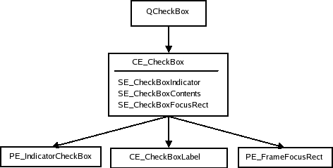
QCommonStyle::drawControl() is used to draw the checkbox by passing the enum value QStyle::CE_CheckBox to this method. The process of drawing a checkbox involves drawing two sub elements. The common style implementation gets the bounding rectangles of these two sub elements and then draws each one. If the checkbox has focus a focus frame will also be drawn.
- Checked indicator, which is the square box
- Contents area, which includes the checkbox label
The base class implementation in QCommonStyle will draw the QStyle::CE_CheckboxLabel. The visualAlignment() method adjusts the alignment of text according to the layout direction. Then it draws an icon if one exists and adjust the space left for the text. The drawItemText() draws the text taking alignment, layout direction, and the mnemonic into account. It also uses the palette to draw the text in the correct color.
Our custom Java style draws the first sub element which is indicated by the enum value QStyle::CE_CheckBoxIndicator. The following is part of our custom Java implementation.
The first step is to save the state of the painter. This is not always necessary but in this case the QWindowsStyle needs the painter in the same state as it was when PE_IndicatorCheckBox was called. Then we call drawButtonBackground() to draw the background of the check box indicator. This method draws the background and also the frame of push buttons and check boxes.
The next step is to check if the mouse is hovering over the checkbox. If it is, we draw the frame required for a Java checkbox. Java does not handle tristate boxes so we have not implemented this feature.
A png image is used for our indicator. If desired, you can check if the widget is disabled and then use another image with the indicator in the disabled color.
The following code implements its own push button label since the Java look and feel requires the button contents should be centered when the button has an icon.
We have seen how check boxes are styled in our custom Java style from the time the widget gets a paint request to the time the style is finished painting. The widget builds a style option and calls on the style one or more times to draw the style elements.
Java Style: Widgets
In this section we will examine how some of the CopperSpice widgets are styled and show more of our custom Java style example. Some of the sub elements will not be drawn by our custom style since they are not part of the Java look and feel.
For every widget the following will be shown.
- A table with the members and variables used in the corresponding style option
- A table of the state flags which can be set for the given widget
- An element tree
- An image of the widget with the elements outlined
The element tree contains the primitive, control, and complex style elements. By doing a top-down traversal of the element tree, you get the sequence in which the elements should be drawn. In the nodes, we have written the sub element rectangles, sub control elements, and pixel metrics that should be considered when drawing the element of the node.
Our approach on styling center on the drawing of the widgets. The calculations of sub elements rectangles, sub controls, and pixel metrics used during drawing is only listed as contents in the element trees. There are rectangles and pixel metrics that are only used by widgets. This leaves these calculations untreated in the walk through. For instance, the subControlRect() and sizeFromContents() functions often call subElementRect() to calculate their bounding rectangles. We could draw trees for this as well. However, how these calculations are done is completely up to the individual styles, and they do not have to follow a specific structure (CopperSpice does not impose a specific structure). You should still make sure that you use the appropriate pixel metrics, though. To limit the size of the document, we have therefore chosen not to include trees or describe the calculations made by the Java (or any other) style.
If you are unsure about how the different pixel metrics, sub element rectangles, and sub control rectangles should be used when examining the trees, review the QStyle enum descriptions in the QCommonStyle and QWindowsStyle implementations.
Some of the bounding rectangles outlined in the widget images are equal. This is because some elements draw backgrounds while others draw frames and labels. You may want to verify the description of each element in QStyle. Some of the elements are there to layout other elements.
Common Widget Properties
Some states and variables are common for all widgets. These are set with QStyleOption::initFrom(). It is the widgets which create the style options and for some elements the information from initFrom() is not necessary.
A table with the common states follows.
| State | State Set When |
|---|---|
| State_Enabled | Set if the widget is not disabled (see QWidget::setEnabled()) |
| State_Focus | Set if the widget has focus (see QWidget::hasFocus()) |
| State_KeyobordFocusChange | Set when the user changes focus with the keyboard (Refer to Qt::WA_KeyboardFocusChange) |
| State_MouseOver | Set if the mouse cursor is over the widget |
| State_Active | Set if the widget is a child of the active window. |
| State_HasEditFocus | Set if the widget has the edit focus |
The other common members for widgets are shown below.
| Member | Content |
|---|---|
| rect | Bounding rectangle of the element to draw. This is set to the widget bounding rectangle (QWidget::rect()). |
| direction | Layout direction, a value of the Qt::LayoutDirection enum. |
| palette | QPalette to use when drawing the element. This is set to the widgets palette (QWidget::palette()). |
| fontMetrics | QFontMetrics to use when drawing text on the widget. |
The complex style options (classes that inherit QStyleOptionComplex) used for complex style elements share two variables: subControls and activeSubControls. Both variables are an OR'ed combination of QStyle::SubControl enum values. They indicate which sub controls the complex control consists of and which of these controls are currently active.
As mentioned, the style calculates the size of the widgets contents, which the widgets calculate their size hints from. In addition, complex controls also use the style to test which subcontrols the mouse is over.
Java Style: Push Buttons
The style structure for push buttons is shown in the following image. A top down traversal of the tree indicates the sequence in which elements should be drawn.
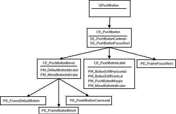
The layout of buttons will vary from style to style and elements may even overlap. For example, the PE_PushButtonBevel is used in QCommonStyle to draw its child elements and the enum value PE_PushButtonBevel is used when drawing a menu indicator.
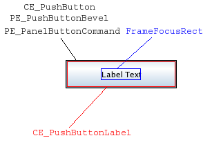
An image of a push button in our custom Java style shows the bounding rectangles of the elements. Colors are used to separate the bounding rectangles in the image, they do not fill any other purpose. This is also true for similar images for the other widgets.
Our custom Java style, as well as all other styles implemented in CopperSpice, do not use PE_FrameButtonBevel. Normally a button with a PE_DefaultFrame adjusts the PE_PanelButtonCommand's rectangle by PM_ButtonDefaultIndicator. The CE_PushButtonLabel is found by adjusting the rect by PM_DefaultFrameWidth.
The style option for push buttons uses the QStyleOptionButton class. This table indicates the states QPushButton can set for a style option.
| State | State Set When |
|---|---|
| State_Sunken | Button is down or menu is pressed shown |
| State_On | Button is checked |
| State_Raised | Button is not flat and not pressed down |
Other members of QStyleOptionButton are shown below.
| Member | Content |
|---|---|
| features | Flags of the QStyleOptionButton::ButtonFeatures enum, which describes various button properties (see enum) |
| icon | The buttons QIcon (if any) |
| iconSize | QSize of the icon |
| text | QString with the buttons text |
Java Style: Checkboxes and Radio Buttons
The structures for radio and check buttons are identical. We show the structure using QCheckBox element and pixel metric names.
QStyleOptionButton is used as the style option for both check and radio buttons. We first give a table of the states that can be set in the option.
| State | State Set When |
|---|---|
| State_sunken | Box is pressed down |
| State_NoChange | Box is partially checked (for tristate checkboxes.) |
| State_On | Box is checked |
| State_Off | Box is unchecked |
Refer to Push Buttons for a table over other members in the QStyleOptionButtonClass.
Java Style: Tabs
QTabBar uses the style to draw its tabs. Tabs exist either in a QTabWidget, which contains a QTabBar, or as a separate bar. If the bar is not part of a tab widget, it draws its own base.
QTabBar lays out the tabs, so the style does not have control over tab placement. However, while laying out its tabs, the bar asks the style for PM_TabBarTabHSpace and PM_TabBarTabVSpace, which is extra width and height over the minimum size of the tab bar tab label (icon and text). The style can also further influence the tab size before it is laid out, as the tab bar asks for CT_TabBarTab. The bounding rectangle of the bar is decided by the tab widget when it is part of the widget (still considering CT_TabBarTab).
The tab bar is responsible for drawing the buttons that appear on the tab bar when all tabs do not fit. Their placement is not controlled by the style, but the buttons are QToolButtons and are therefore drawn by the style.
Here is the style structure for QTabWidget and QTabBar:
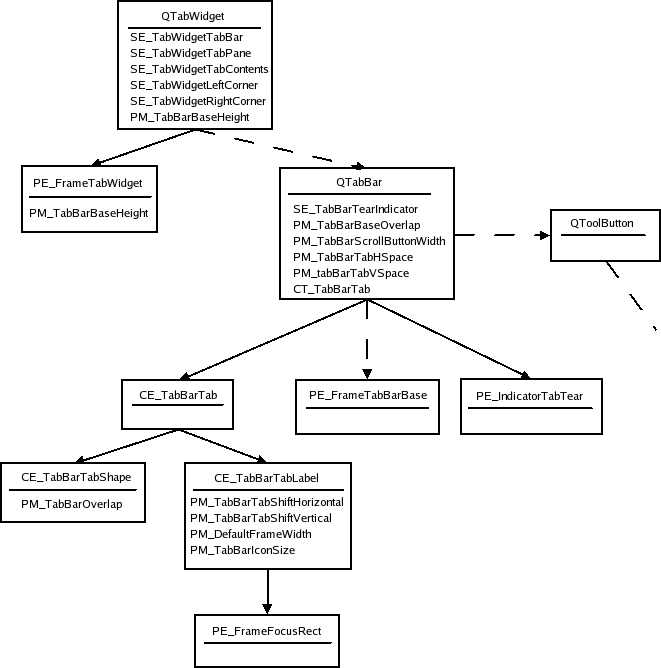
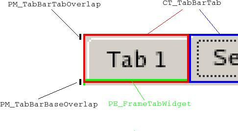
The dotted lines indicate that the QTabWidget contains a tab bar, but does not draw it itself, that QTabBar only draws its base line when not part of a tab widget, and that the tab bar keeps two tool buttons that scroll the bar when all tabs do not fit; see Tool Buttons for their element tree. Since the buttons are children of the tab bar, they are drawn after the bar. The tabs bounding rectangles overlap the base by PM_TabBarBaseOverlap.
This shows a tab widget in our custom Java style.
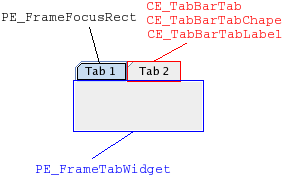
In the Java style (and also windows), the tab bar shape and label have the same bounding rectangle as CE_TabBarTab. Notice that the tabs overlap with the tab widget frame. The base of the tab bar (if drawn) is the area where the tabs and frame overlap.
The style option for tabs (QStyleOptionTab) contains the necessary information for drawing tabs. The option contains the position of the tab in the tab bar, the position of the selected tab, the shape of the tab, the text, and icon. The option should be cast to a QStyleOptionTabV2, which also contains the icons size.
As the Java style tabs do not overlap, we also present an image of a tab widget in the windows style. If you want the tabs to overlap horizontally, you do that when drawing the tabs in CE_TabBarTabShape; the tabs bounding rectangles will not be altered by the tab bar. The tabs are drawn from left to right in a north tab bar shape, top to bottom in an east tab bar shape, etc. The selected tab is drawn last, so that it is easy to draw it over the other tabs.
A table of the states a tab bar can set on its tabs follows:
| State | State Set When |
|---|---|
| State_Sunken | Tab is pressed on with the mouse. |
| State_Selected | If it is the current tab. |
| State_HasFocus | Tab bar has focus and the tab is selected |
Individual tabs may be disabled even if the tab bar is not. The tab will be active if the tab bar is active. The following is a table of QStyleOptionTab members.
| Member | Content |
|---|---|
| cornerWidgets | Flags of the CornerWidget enum, which indicate if and which corner widgets the tab bar has. |
| icon | QIcon of the tab |
| iconSize | QSize of the icon |
| position | TabPosition enum value that indicates the tabs position on the bar relative to the other tabs. |
| row | Holds which row the tab is in |
| selectedPosition | Value of the SelectedPosition enum that indicates whether the selected tab is adjacent to or is the tab. |
| shape | Value of the QTabBar::Shape enum indication whether the tab has rounded or triangular corners and the orientation of the tab. |
| text | Tab text |
The frame for tab widgets use QStyleOptionTabWidgetFrame as style option. We list its members here. It does not have states set besides the common flags.
| Member | Content |
|---|---|
| leftCornerWidgetSize | QSize of the left corner widget (if any). |
| rightCornerWidgetSize | QSize of the right corner widget (if any). |
| lineWidth | Holds the line with for drawing the panel. |
| midLineWith | This value is currently always 0. |
| shape | Shape of the tabs on the tab bar. |
| tabBarSize | QSize of the tab bar. |
Java Style: Scroll Bars
This is the style structure for scrollBars.
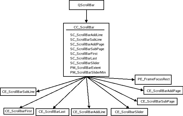
QScrollBar simply creates its style option and then draws CC_ScrollBar. Some styles draw the background of add page and sub page with PE_PanelButtonBevel and also use indicator arrows to draw the arrows in the nest and previous line indicators; we have not included these in the tree as their use is up to the individual style. The style's PM_MaximumDragDistance is the maximum distance in pixels the mouse can move from the bounds of the scroll bar and still move the handle.
Here is an image of a scrollbar in our custom Java style.
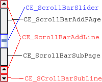
You may notice that the scrollbar is slightly different from Java's as it has two line up indicators. We have done this to show how that you can have two separate bounding rectangles for a single sub control. The scroll bar is an example of a widget that is entirely implemented by the custom Java style. Neither QWindowsStyle nor QCommonStyle are involved in the drawing.
We have a look at the different states a scroll bar can set on the style option:
| State | State Set When |
|---|---|
| State_Horizontal | Scroll bar is horizontal |
The style option of QScrollBar is QStyleOptionSlider. The are listed in the following table. The option is used by all QAbstractSliders; we only describe the members relevant for scroll bars here.
| Member | Content |
|---|---|
| maximum | Maximum value of the scroll bar |
| minimum | Minimum value of the scroll bar |
| notchTarget | Number of pixels between notches |
| orientation | Value of the Qt::Orientation enum that specifies whether the scroll bar is vertical or horizontal |
| pageStep | Number to increase or decrease the sliders value (relative to the size of the slider and its value range) on page steps. |
| singleStep | Number to increase or decrease the sliders value on single (or line) steps |
| sliderValue | Value of the slider |
| sliderPosition | Position of the slider handle. This is the same as sliderValue if the scroll bar is QAbstractSlider::tracking. If not, the scroll bar does not update its value before the mouse releases the handle. |
| upsideDown | Holds the direction in which the scroll bar increases its value. Use instead of QStyleOption::direction for all abstract sliders. |
Java Style: Sliders
When calculating the sliders size hint, PM_SliderTickness and PM_SliderLength is queried from the style. As with scroll bars, the QSlider only lets the user move the handle if the mouse is within PM_MaximumDragDistance from the slider bounds. When it draws itself it creates the style option and calls drawComplexControl() with CC_Slider:
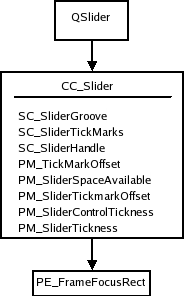
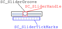
We also show a picture of a slider in our custom Java style. We show the bounding rectangles of the sub elements as all drawing is done in CC_Slider.
QSlider uses QStyleOptionSlider as all QAbstractSliders. The following table shows the members that affect QSlider.
| Member | Content |
|---|---|
| maximum | Maximum value of the slider |
| minimum | Minimum value of the slider |
| notchTarget | Number of pixels between each notch |
| orientation | Qt::Orientation enum value that gives whether the slider is vertical or horizontal. |
| pageStep | Number in slider value to increase or decrease for page steps |
| singleStep | Number to increase or decrease the sliders value on single (or line) steps. |
| sliderValue | Value of the slider. |
| sliderPosition | Position of the slider given as a slider value. This will be equal to the sliderValue if the slider is tracking. If not, the slider's value will not change until the handle is released with the mouse. |
| upsideDown | Member is used instead of QStyleOption::direction for all abstract sliders. |
The slider does not use direction for reverse layouts, it uses upsideDown.
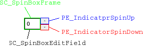
Java Style: Spin Boxes
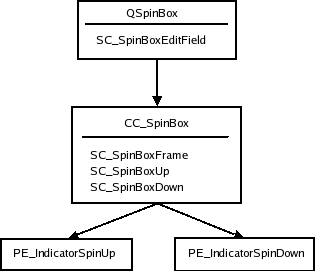
When QSpinBox paints itself it creates a QStyleOptionSpinBox and asks the style to draw CC_SpinBox. The edit field is a line edit that is a child of the spin box. The dimensions of the field is calculated by the style with SC_SpinBoxEditField.
Here follows the style tree for spin boxes. It is not required that a style uses the button panel primitive to paint the indicator backgrounds. You can see an image below the tree showing the sub elements in QSpinBox in our custom Java style.
The QStyleOptionSpinBox, which is the style option for spin boxes. It can set the following states on the spin box.
| State | State Set When |
|---|---|
| State_Sunken | Set if one of the sub controls CC_SpinUp or CC_SpinDown is pressed on with the mouse. |
The rest of the members in the spin boxes style options are:
| Property | Function |
|---|---|
| frame | Boolean that is true if the spin box is to draw a frame. |
| buttonSymbols | Value of the ButtonSymbols enum that decides the symbol on the up/down buttons. |
| stepEnabled | Value of the StepEnabled indication which of the spin box buttons are pressed down. |
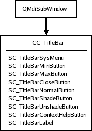
Java Style: Title Bar
The title bar complex control, CC_TitleBar, is used to draw the title bars of internal windows in QMdiArea. It typically consists of a window title and close, minimize, system menu, and maximize buttons. Some styles also provide buttons for shading the window, and a button for context sensitive help.
The bar is drawn in CC_TitleBar without using any sub elements. How the individual styles draw their buttons is individual, but there are standard pixmaps for the buttons that the style should provide.
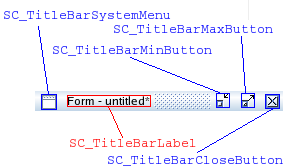
In an image over a title bar, in our custom Java style, the bounding rectangles of the sub elements are supported by the Java style. It is not required, however it is customary to draw the button backgrounds using PE_PanelButtonTool.
The style option for title bars is QStyleOptionTitleBar. It's members are:
| Member | Content |
|---|---|
| icon | Title bar icon |
| text | Text for the title bar's label |
| windowFlags | Flags of the Qt::WindowFlag enum. The window flags used by QMdiArea for window management. |
| titleBarState | This is the QWidget::windowState() of the window that contains the title bar. |
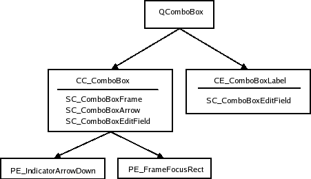
Java Style: Combo Box
A QComboBox uses the style to draw the button and label of non-editable boxes with CC_ComboBox and CE_ComboBoxLabel.
The list that pops up when the user clicks on the combo box is drawn by a delegate, which we do not cover in this overview. You can, however, use the style to control the list's size and position with the sub element SC_ComboBoxListBoxPopup. The style also decides where the edit field for editable boxes should be with SC_ComboBoxEditField; the field itself is a QLineEdit that is a child of the combo box.
We show an image over a Java style combo box in which we have outlined its sub elements and sub element rectangles:
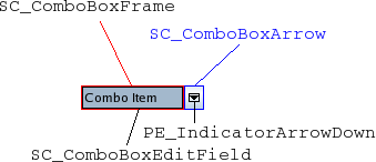
Java combo boxes do not use the focus rect. Instead, the background color changes. The SC_ComboBoxEdit field is used both by QComboBox to calculate the size of the edit field and the style for calculating the size of the combo box label.
The style option for combo boxes is QStyleOptionComboBox. It can set the following states:
| State | Set When |
|---|---|
| State_Selected | The box is not editable and has focus |
| State_Sunken | SC_ComboBoxArrow is active |
| State_on | The container (list) of the box is visible |
The style options other members are:
| Member | Content |
|---|---|
| currentIcon | Icon of the current (selected) item of the combo box. |
| currentText | Text of the current item in the box. |
| editable | Holds whether the combo box is editable or not |
| frame | Holds whether the combo box has a frame or not |
| iconSize | Size of the current items icon. |
| popupRect | Bounding rectangle of the combo box's popup list. |
Java Style: Group Boxes
When calculating the size hint, QGroupBox fetches three pixel metrics from the style: PM_IndicatorWidth, PM_CheckBoxLabelSpacing, and PM_IndicatorHeight. QGroupBox has the following style element tree.
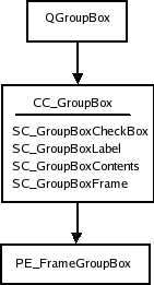
CopperSpice does not impose restrictions on how the check box is drawn. Our custom Java style draws it with CE_IndicatorCheckBox. Refer to Check and Radio Buttons for the complete tree.
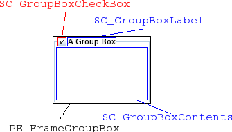
We also give an image of the widget with the sub controls and sub control rectangles drawn:
The style option for group boxes are QStyleOptionGroupBox. The following states can be set on it:
| State | Set When |
|---|---|
| State_On | Check box is checked |
| State_Sunken | Check box is pressed down |
| State_Off | Check box is unchecked (or there is no check box) |
The remaining members of QStyleOptionGroupBox are:
| Member | Content |
|---|---|
| features | Flags of the QStyleOptionFrameV2::FrameFeatures enum describing the frame of the group box. |
| lineWidth | Line width with which to draw the panel. This is always 1. |
| text | Text of the group box. |
| textAlignment | Alignment of the group box title |
| textColor | QColor of the text |
Java Style: Splitters
The structure of a splitter does not contain any sub elements. CE_Splitter does not use any other elements or metrics. For its style option, QSplitter uses the base class QStyleOption.
QSplitter does not use initFrom() to set up its option. This class sets the State_MouseOver and State_Disabled flags automatically.
The following states are supported.
| State | Set When |
|---|---|
| State_Horizontal | Set if it is a horizontal splitter |
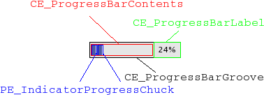
Java Style: Progress Bar
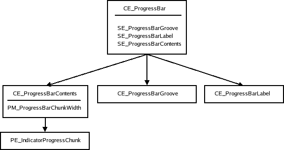
QProgressBar only uses the CE_ProgressBar element. The style structure is shown in the following diagram.
This is a progress bar drawn in the windows style.
The style option for QProgressBar is QStyleOptionProgressBar. The bar does not set any state flags. The other members of the option class are shown below.
| Member | Content |
|---|---|
| minimum | Minimum value of the bar |
| maximum | Maximum value of the bar |
| progress | Current value of the bar |
| textAlignment | How the text is aligned in the label |
| textVisible | Whether the label is drawn |
| text | Label text |
| orientation | Progress bars can be vertical or horizontal |
| invertedAppearance | Progress is inverted (i.e., right to left in a horizontal bar) |
| bottomToTop | Boolean that if true, turns the label of vertical progress bars 90 degrees. |
Java Style: Tool Buttons
Tool buttons exist either independently or as part of a toolbar and are drawn the same way. The QToolButton draws only one style element: CC_ToolButton.
The following tree shows the widget's style structure.
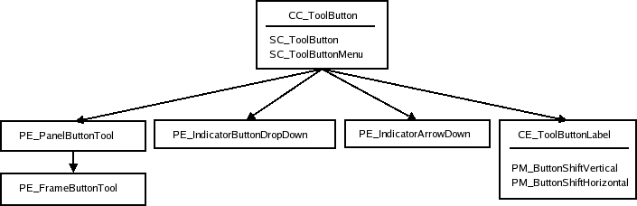
PE_FrameButtonTool and PE_IndicatorArrowDown are included in the tree as the Java style draws them, but they can safely be omitted. The structure may also be different for different styles. QWindowsStyle, for instance, draws both PE_IndicatorButtonDropDown and PE_IndicatorArrowDown in CE_ToolButton.
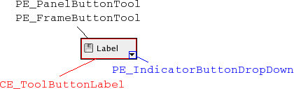
The following image of a tool button has been outlined to show the sub element bounding rectangles and sub controls.
The table shown below shows the different states for a tool button.
| State | Set When |
|---|---|
| State_AutoRise | Tool button has the autoRise property set |
| State_raised | Button is not sunken (i.e., by being checked or pressed on with the mouse). |
| State_Sunken | Button is down |
| State_On | Button is checkable and checked. |
QStyleOptionToolButton contains the following data members.
| Member | Content |
|---|---|
| arrowType | Qt::ArrowType enum value, which contains the direction of the buttons arrow (if an arrow is to be used in place of an icon) |
| features | Flags of the QStyleOptionToolButton::ButtonFeature enum describing if the button has an arrow, a menu, and/or has a popup-delay. |
| font | QFont of the buttons label |
| icon | QIcon of the tool button |
| iconSize | Icon size of the button's icon |
| pos | Position of the button, as given by QWidget::pos() |
| text | Text of the button |
| toolButtonStyle | Qt::ToolButtonStyle enum value which decides whether the button shows the icon, the text, or both. |
Java Style: Toolbars
Toolbars are part of the main window and cooperates with the QMainWindow to which it belongs while it builds its style option. A main window has 4 areas that toolbars can be placed in. They are positioned next to the four sides of the window (i.e., north, south, west, and east). Within each area there can be more than one line of toolbars. A line consists of toolbars with equal orientation (vertical or horizontal) placed next to each other.
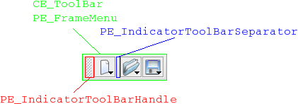
QToolbars in CopperSpice consists of three elements CE_ToolBar, PE_IndicatorToolBarHandle, and PE_IndicatorToolBarSeparator. It is QMainWindowLayout that calculates the bounding rectangles (i.e., position and size of the toolbars and their contents. The main window also uses the sizeHint() of the items in the toolbars when calculating the size of the bars.
This is the element tree for QToolBar.
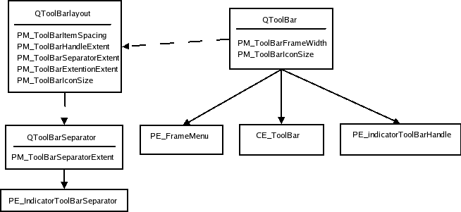
The dotted lines indicate that the QToolBar keeps an instance of QToolBarLayout and that QToolBarSeparators are kept by QToolBarLayout. When the toolbar is floating (i.e., has its own window) the PE_FrameMenu element is drawn, else QToolbar draws CE_ToolBar.
The following shows a toolbar in our custom Java style.
QToolBarSaparator uses QStyleOption for their style option. It sets the State_horizontal flag if the toolbar they live in is horizontal. Other than that, they use initFrom().
The style option for QToolBar is QStyleOptionToolBar. The only state flag set (besides the common flags) is State_Horizontal if the bar is horizontal (i.e., in the north or south toolbar area). The member variables of the style option are shown below.
| Member | Content |
|---|---|
| features | Holds whether the bar is movable in a value of the ToolBarFeature, which is either Movable or None. |
| lineWidth | Width of the toolbar frame. |
| midLineWidth | Variable is currently not used and is always 0. |
| positionOfLine | Position of the toolbar line within the toolbar area to which it belongs. |
| positionWithinLine | Position of the toolbar within the toolbar line. |
| toolBarArea | Toolbar area in which the toolbar lives. |
Java Style: Menus
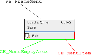
Menus in CopperSpice are implemented in QMenu. The QMenu keeps a list of action, which it draws as menu items. When QMenu receives paint events ,it calculates the size of each menu item and draws them individually with CE_MenuItem. (Menu items do not have a separate element for their label (contents), so all drawing is done in CE_MenuItem. The menu also draws the frame of the menu with PE_FrameMenu. It also draws CE_MenuScroller if the style supports scrolling. CE_MenuTearOff is drawn if the menu is to large for its bounding rectangle.
In the style structure tree, we also include QMenu as it also does styling related work. The bounding rectangles of menu items are calculated for the menus size hint and when the menu is displayed or resized.
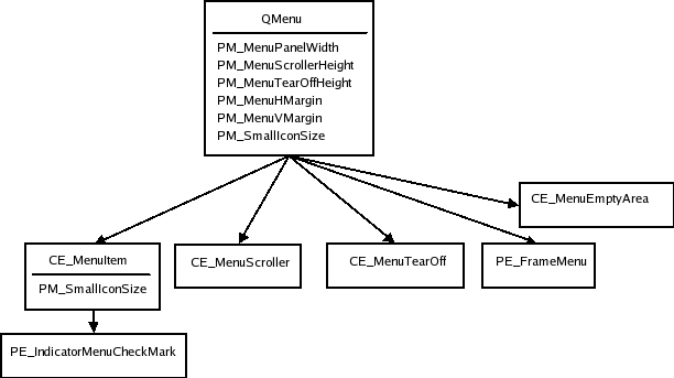
The CE_MenuScroller and CE_MenuTearOff elements are handled by QCommonStyle and are not shown unless the menu is to large to fit on the screen. PE_FrameMenu is only drawn for pop-up menus.
QMenu calculates rectangles based on its actions and calls CE_MenuItem and CE_MenuScroller if the style supports that.
It is also usual to use PE_IndicatorCheckBox (instead of using PE_IndicatorMenuCheckMark) and PE_IndicatorRadioButton for drawing checkable menu items; we have not included them in the style tree as this is optional and varies from style to style.
The style option for menu items is QStyleOptionMenuItem. The following tables describe its state flags and other members.
| State | Set When |
|---|---|
| State_Selected | The mouse is over the action and the action is not a separator. |
| State_Sunken | The mouse is pressed down on the menu item. |
| State_DownArrow | Set if the menu item is a menu scroller and it scrolls the menu downwards. |
| Member | Content |
|---|---|
| checkType | Value of the CheckType enum, which is either NotCheckable, Exclusive, or NonExclusive. |
| checked | Boolean that is true if the menu item is checked. |
| font | QFont to use for the menu item's text. |
| icon | QIcon of the menu item. |
| maxIconWidth | Maximum width allowed for the icon |
| menuHasCheckableItem | Boolean which is true if at least one item in the menu is checkable. |
| menuItemType | The type of the menu item. This a value of the MenuItemType. |
| menuRect | Bounding rectangle for the QMenu that the menu item lives in. |
| tabWidth | This is the distance between the text of the menu item and the shortcut. |
| text | Text of the menu item. |
The setup of the style option for CE_MenuTearOff and CE_MenuScroller also uses QStyleOptionMenuItem; they only set the menuRect variable in addition to the common settings with QStyleOption's initFrom().
Java Style: Menu Bar
QMenuBar uses the style to draw each menu bar item and the empty area of the menu bar. The pull-down menus themselves are QMenus (refer to Menus). The style element tree for the menu bar follows.
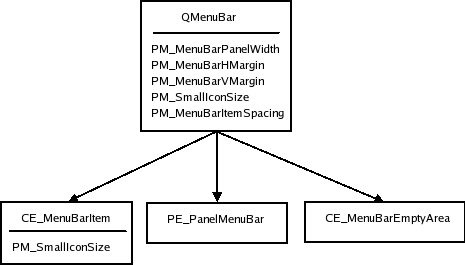
The panel and empty area is drawn after the menu items. The QPainter that the QMenuBar sends to the style has the bounding rectangles of the items clipped out (i.e., clip region), so you do not need to worry about drawing over the items. The pixel metrics in QMenuBar is used when the bounding rectangles of the menu bar items are calculated.
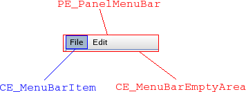
QStyleOptionMenuItem is used for menu bar items. The members that are used by QMenuBar is described in the following table:
| Member | Content |
|---|---|
| menuRect | Bounding rectangle of the entire menu bar to which the item belongs. |
| text | Text of the item |
| icon | Icon of the menu item (it is not common that styles draw this icon) |
QStyleOptionMenuItem is also used for drawing CE_EmptyMenuBarArea. QStyleOptionFrame is used for drawing the panel frame. The lineWidth is set to PM_MenuBarPanelWidth. The midLineWidth is currently always set to 0.
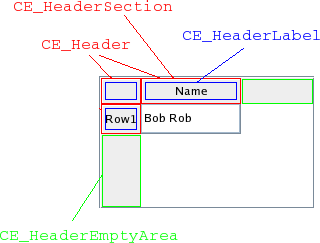
Java Style: Item View Headers
It is the style that draws the headers of the CopperSpice item views. The item views keeps the dimensions on individual sections. The delegates may use the style to paint decorations and frames around items. QItemDelegate, for instance, draws PE_FrameFocusRect and PE_IndicatorViewItemCheck.
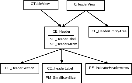
Here is a QTableWidget showing the bounding rects of a Java header.
The QHeaderView uses CT_HeaderSection, PM_HeaderMargin and PM_HeaderGripMargin for size and hit test calculations. The PM_HeaderMarkSize is currently not used by CopperSpice. QTableView draws the button in the top-left corner (i.e., the area where the vertical and horizontal headers intersect) as a CE_Header.
The style option for header views is QStyleOptionHeader. The view call QStyle for each header section separately so the style option applies to the current section only. The contents are as follows.
| Member | Content |
|---|---|
| icon | Icon of the header (for section that is being drawn). |
| iconAlignment | Alignment (Qt::Alignment) of the icon in the header. |
| orientation | Qt::Orientation value deciding whether the header is the horizontal header above the view or the vertical header on the left. |
| position | QStyleOptionHeader::SectionPosition value giving the header section's position relative to the other sections. |
| section | Holds the section that is being drawn. |
| selectedPosition | QStyleOptionHeader::SelectedPosition value giving the selected section's position relative to the section that is being painted. |
| sortIndicator | QStyleOptionHeader::SortIndicator value that describes the direction in which the section's sort indicator should be drawn. |
| text | Text of the currently drawn section. |
| textAlignment | Qt::Alignment of the text within the headersection. |
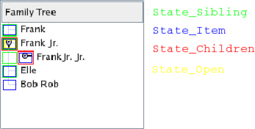
Java Style: TreeView Indicators
The branch indicators in a tree view is drawn by the style with PE_IndicatorBranch. We think of indicators here as the indicators that describe the relationship of the nodes in the tree. The generic QStyleOption is sent to the style for drawing this elements. The various branch types are described by states. Since there are no specific style option, we simply present the states table:
| State | Set When |
|---|---|
| State_Sibling | Node in the tree has a sibling (i.e., there is another node in the same column). |
| State_Item | Branch indicator has an item. |
| State_Children | Branch has children (i.e., a new sub-tree can be opened at the branch). |
| State_Open | Branch indicator has an opened sub-tree. |
The tree view (and tree widget) use the style to draw the branches (or nodes if you will) of the tree. QStyleOption is used as the style for PE_IndicatorBranch has state flags set depending on what type of branch it is.
Since there is no tree structure for branch indicators, we only present an image of a tree in the Java style. Each state is marked in the image with a rectangle in a specific color (i.e., these rectangles are not bounding rectangles). All combinations of states you must be aware of are represented in the image.
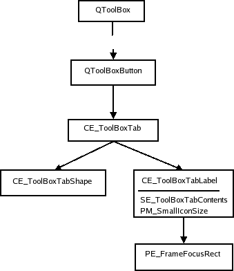
Java Style: Tool Boxes
PM_SmallIconSize for sizeHints.
QToolBox is a container that keeps a collection of widgets. It has one tab for each widget and display one of them at a time. The tool box lays the components it displays (the tool box buttons and selected widget) in a QVBoxLayout. The style tree for tool boxes looks like this:
We show an image of a tool box in the Plastique style:
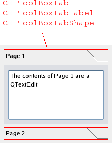
All elements have the same bounding rectangles in the Plastique as well as the other CopperSpice built-in styles.
The style option for tool boxes is QStyleOptionToolBox. It contains the text and icon of the tool box contents. The only state set by QToolBox is State_Sunken, which is set when the user presses a tab down with the mouse. The rest of the QStyleOptionToolBox members are:
| Member | Content |
|---|---|
| icon | Icon on the toolbox tab |
| text | Text on the toolbox tab |
Java Style: Size Grip
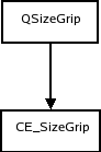
The size grip calculates its size hint with CT_SizeGrip. The pixel metric PM_SizeGripSize is currently unused by CopperSpice. The element tree for and an image in the Plastique style of QSizeGrip follows:
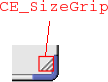
We show the size grip in a QMainWindow's bottom right corner. The size grip style option, QStyleOptionSizeGrip, have one member except the common members from QStyleOption.
| Member | Content |
|---|---|
| corner | Qt::Corner value describing which corner in a window the grip is located |
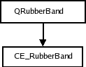
Java Style: Rubber Band
The QRubberBand style tree consists of two nodes.
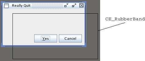
We present an image of a Java style window being moved in a QMdiArea with a rubber band:
The style option for rubber bands is QStyleOptionRubberBand. Its members are:
| Member | Content |
|---|---|
| opaque | Boolean, true if the rubber band must be drawn in an opaque style (i.e., color) |
| shape | QRubberBand::Shape enum value which holds the shape of the band which is either a rectangle or a line |
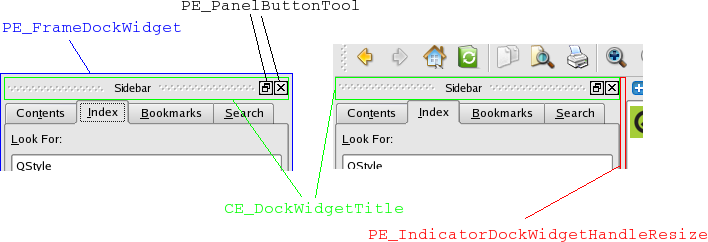
Java Style: Dock Widgets
When the dock widget lays out its contents it calculates the bounding rectangles of the float and close buttons with SE_DockWidgetCloseButton and SE_DockWidgetFloatButton. It uses the style for these pixel metrics.
- PM_DockWidgetSeparatorExtent
- PM_DockWidgetTitleBarButtonMargin
- PM_DockWidgetFrameWidth
- PM_DockWidgetTitleMargin
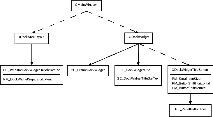
The dock widget only draws PE_frameDockWidget when it is detached from its main window. When the dock widget is docked it draws the indicator dock widget resize handle.
The style option is QStyleOptionDockWidget.
| Member | Content |
|---|---|
| closeable | Boolean, holds whether the dock window can be closed |
| floatable | Boolean, holds whether the dock window can float |
| movable | Boolean, holds whether the window is movable |
| title | Text title for the dock window |
For the buttons we are using QStyleOptionButton. Refer to Tool Buttons.
The dock widget resize handle uses a QStyleOption.
- Generated on Fri Jan 30 2026 10:00 by
 2.1.0
2.1.0